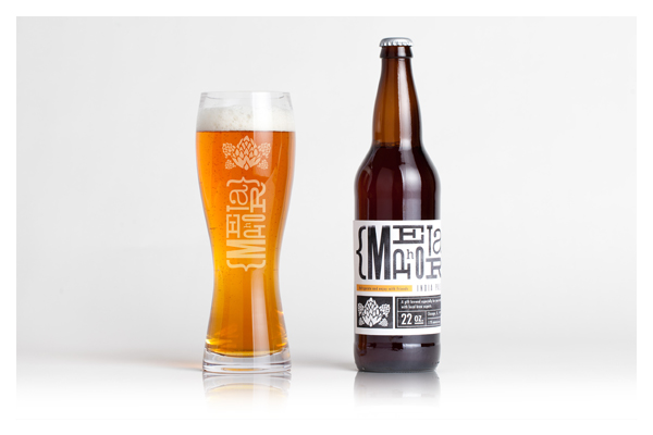
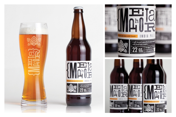
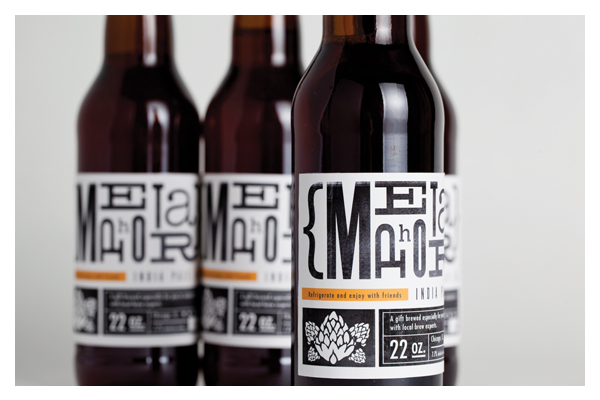
Metaphor IPA
Package Design
Metaphor IPA was created, brewed, and packaged to serve as a self promotion. The metaphor is the
comparison of a company that stands behind a credo of "quality not quantity" and relating that to the
concept of a micro-brewery. Where as micro brews are hand crafted and sold hand to hand to true enthusiasts.
The label was designed to have the aesthetic of something hand crafted. During the conceptual stage I
was thinking of goods people give or receive that are unique and created by hand. A letterpress approach
stood out to me as a great direction. Not only the spacing and spontaneity of the characters but the texture
that is created during each print makes every print unique.